This post may contain affiliate links. Please see my disclosure policy
This warm and creamy chicken wild rice casserole is a satisfying dinner loaded with juicy chunks of chicken, meaty mushrooms, and nutty wild rice baked in buttery white sauce.
If you love the flavors in this easy wild rice casserole, check out my chicken wild rice soup and creamy mushroom rice pilaf, next! This turkey and wild rice soup is also a great recipe for using up leftover holiday turkey.

Table of Contents
Whenever I’m craving a big plate of comfort food, I make this chicken wild rice casserole. It’s a warm and flavor-packed dinner, with juicy chicken pieces and mushrooms tossed with buttery white sauce and wild rice. The whole dish is quick to assemble (just 10 minutes!), and it bakes up golden in about an hour. I’ll sometimes even prep the casserole the day before, so it’s ready to go for an easy weeknight meal. Just pop it in the oven, and bake!
Why I Love This Chicken Wild Rice Casserole
- Creamy texture. This chicken and wild rice casserole is rich and creamy, with earthy mushrooms and juicy bites of chicken wrapped in a wild rice blend. Unlike other rice varieties, wild rice doesn’t become mushy, so the texture stays toothsome and delicious.
- No canned soup. I make a simple homemade white sauce from flour, butter, and milk. It’s quick and easy to whisk together in the same pan you use to sauté the chicken and veggies.
- Adaptable. This casserole recipe is SUPER flexible! Instead of chicken breasts, opt for thighs or use a rotisserie chicken from the store for extra convenience. I love that I can change up the recipe with different veggies, too, depending on what I have in the fridge.
- Make-ahead friendly. Whether you prep the individual components or assemble the whole casserole in advance, there are lots of ways to get a headstart on this chicken wild rice casserole. You can even freeze the baked or unbaked casserole for easy dinners down the road.

Ingredients You’ll Need
Below is a quick overview of the ingredients along with some notes. This chicken wild rice casserole is very adaptable, though, and I include some easy variations further in the post. Also, be sure to scroll to the printable recipe card for the full recipe amounts and details.
- Chicken – Just about any chicken will work here. I like to use skinless, boneless chicken breasts as they’re easiest to chop into bite-sized cubes. You can use thighs if you prefer. This recipe even works with cooked leftover chicken breasts, shredded whole chicken, or a rotisserie chicken.
- Oil – Olive oil, or your choice of cooking oil.
- Onion and Garlic – Finely chopped yellow onion and freshly minced garlic are best. If you don’t have fresh, you can substitute ¼ teaspoon of garlic powder per clove, and 1 teaspoon of onion powder per ½ cup of diced onion.
- Mushrooms – I like sliced baby bella (also called cremini) mushrooms. Feel free to use exotic mushrooms like shiitake or oyster mushrooms, too. If mushrooms aren’t your thing, leave them out or replace them with another veggie, like spinach, carrots, celery, or broccoli.
- Wild Rice – Fun fact: Wild rice isn’t actually rice. Its black and brown-colored grains are harvested from a type of marsh grass! Still, you cook it just like rice. Be sure to cook your wild rice al dente (firm when bitten), this way it’ll stay chewy.
- Broth – I like to use low-sodium chicken broth. You can swap this for vegetable broth or stock if needed.
- Butter, Flour, and Milk – The homemade cream sauce starts with a roux of flour and butter (or oil), that’s whisked with milk to make a thick, creamy sauce.
- Seasoning – Fresh or dried thyme, salt, and pepper.
What Rice Is Best for This Casserole?
This chicken casserole gets its delicious texture and earthy flavor from nutty, chewy wild rice, so that’s what I recommend for this recipe. Wild rice is one of my favorite ingredients in recipes like casseroles and soups because it’s nearly impossible to overcook. Simply boil it in chicken broth, checking it every so often until it’s tender.
If you’d like to use another kind of rice, you can use any rice you have on hand. Just keep in mind that it’ll impact the overall flavor and texture of the casserole. Brown rice is the best substitute for wild rice since it has a similar flavor and chewiness. White rice tends to make the casserole a bit bland, and it’s also easier to overcook. Check out my stovetop creamy chicken and rice if you’re looking for a great recipe to make with regular rice.
How to Make Chicken and Wild Rice Casserole
These are the short and sweet steps to make this easy wild rice casserole with tender chicken and mushrooms. Scroll down to the recipe card for the printable instructions.


- Cook the rice. If your box of wild rice comes with a seasoning packet, simply prepare the rice according to the package directions (using chicken broth in place of water). Otherwise, simply boil plain wild rice in the broth.
- Sear the chicken. Meanwhile, season the chicken pieces with salt and pepper. Afterward, sear the chicken in a large skillet with oil for 2-3 minutes per side, until browned.
- Cook the veggies. Remove the chicken from the pan, and add the mushrooms, onions, and garlic. Sauté until the veggies are softened and caramelized.
- Make the sauce. Set the veggies aside. In the same skillet, melt the butter before stirring in the flour to make a roux. Let that cook off and brown a little, then whisk in the milk. Sprinkle in some thyme and season the sauce with salt and pepper while it simmers and thickens.
- Combine. Now, add the cooked rice to a casserole dish along with the mushrooms. Pour over the white sauce, and toss the rice and veggies to coat.
- Bake. Bake this chicken rice casserole at 400ºF for 20 minutes until it’s golden and bubbly.
Casserole Topping Ideas
This chicken and wild rice casserole is delicious without a topping, but if you want to add some extra texture and crunch, there’s definitely the option to do so. Add any toppings after the casserole is in the pan and before you bake. Try finishing this chicken casserole with crispy panko breadcrumbs (like I use for my sausage stuffed mushrooms casserole), or top it with cornflakes, leftover stuffing, crushed croutons, Ritz crackers, or potato chips.

Recipe Tips and Variations
- Don’t overcook the rice. While it’s difficult to overcook wild rice, do your best not to simmer it past al dente. I like to check the rice when there’s still about 15 minutes left in the cooking time and go from there.
- Get a good sear. Don’t overcrowd the pan when cooking the chicken and mushrooms. Both the chicken pieces and sliced mushrooms need enough room to caramelize in the hot pan, otherwise they’ll steam instead of sear. Cook in batches if you need to.
- Cook off the flour. Make sure to stir often and let the flour cook with the butter for a good 1-2 minutes when making the roux for the sauce. This cooks off the “floury” taste and makes for a smoother white sauce with fewer lumps.
- To make a cheesy chicken and rice casserole, freshly grate parmesan cheese, Gruyere, cheddar, Monterey Jack, Asiago cheese, or any combination of cheeses to stir into the casserole before baking. You can also melt the cheese into the white sauce.
- Use a rotisserie chicken. If you’re using pre-cooked chicken, like rotisserie chicken, I recommend shredding it and adding it to the rice at the same time you add the sauce.
- Different protein. Instead of chicken, make this wild rice casserole with another protein, like seared Italian sausage, diced ham, or ground meats, like beef or turkey.
- More veggies. I love filling this chicken and wild rice casserole with veggies I have kicking around in the fridge. Use cooked broccoli for a broccoli chicken rice casserole, or swap the mushrooms for asparagus, diced bell peppers, green beans, zucchini, or peas. Be sure to pre-cook the veggies before adding them to the casserole.
- More add-ins. You can really get creative with what you add to your chicken and rice casserole! Stir in chopped nuts (like walnuts or pecans), olives, green chilies, artichokes, sun-dried tomatoes, etc.

Serving Suggestions
I love this chicken wild rice casserole as a meal-in-one! It has protein, veggies, and grains. All you really need if you want to make it a fuller meal is a green salad (tossed with creamy balsamic vinaigrette) and dinner rolls or garlic bread on the side. I also like this easy Caesar salad or some savory roasted Brussels sprouts. For dessert, sweeten things up with crunchy peanut butter cookies!

Make Ahead
This chicken wild rice casserole is a great make-ahead dinner. All you do is assemble the casserole as written and then cover and refrigerate it unbaked for up to 2 days. When you’re ready to bake, I recommend taking the casserole out of the fridge ahead of time to take the chill off. Then, bake as directed (you may need to add a few extra minutes to the baking time if the casserole is still cold from the fridge).
If you’d like to meal-prep the ingredients instead, you can chop the chicken and cook the rice up to 1 day in advance, and cut up the mushrooms and onions up to 2 days in advance. Keep everything stored in separate containers in the fridge.
Storing and Reheating Leftovers
- Refrigerate. Keep any leftover chicken wild rice casserole airtight in the fridge for up to 4 days.
- Reheat. I like to warm this casserole in the oven under foil at 350ºF until it’s hot throughout. Individual servings can also be reheated in the microwave.
- Freeze. You can freeze the baked or unbaked wild rice casserole for up to 3 months. Allow it to cool and then wrap the casserole in a double layer of plastic wrap. Thaw the casserole in the fridge, and let it sit at room temperature for at least 30 minutes before baking or reheating.
More Chicken and Rice Recipes
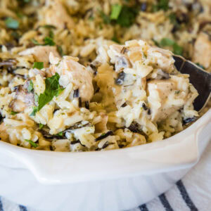
Chicken Wild Rice Casserole
Ingredients
- 1 pound boneless skinless chicken breasts, cut into cubes
- 1 Tablespoon oil
- ½ cup finely chopped onion
- 3 cloves garlic, minced
- 8 oz mushrooms, sliced
- 1 ½ cup uncooked wild rice blend
- 4 ¼ cups chicken broth
- ¼ cup butter
- 3 Tablespoons flour
- 1 cup milk
- ½ teaspoon dried thyme
- Salt & Pepper
Instructions
- Preheat oven to 400º F.
- Bring the chicken broth to a boil and cook the rice according to the package directions.4 ¼ cups chicken broth, 1 ½ cup uncooked wild rice blend
- Meanwhile, in a large skillet, heat oil over medium high heat. Season chicken pieces with salt and pepper. Add to hot skillet and cook for 2-3 minutes per side until the chicken is browned. Remove from skillet.1 pound boneless skinless chicken breasts, Salt & Pepper, 1 Tablespoon oil
- Add the mushrooms, onion and garlic and cook for 5-7 minutes until mushrooms and browned and have softened. Remove from skillet.½ cup finely chopped onion, 8 oz mushrooms, 3 cloves garlic
- Add the butter to the skillet and let it melt. Stir in the flour until it is lightly golden brown. Whisk in milk until nice and smooth. Season with thyme, salt & pepper. Let mixture cook for 2-3 minutes until it starts to thicken.¼ cup butter, 3 Tablespoons flour, 1 cup milk, ½ teaspoon dried thyme, Salt & Pepper
- In a casserole dish combine cooked rice, chicken, mushrooms, and white sauce. Mix until everything is well coated.
- Place in oven and cook for about 20 minutes until everything is hot and bubbly.
Notes
- You can use rotisserie chicken, leftover chicken, etc.
- If you’re using a boxed wild rice mix that comes with a seasoning packet, just follow the box directions using chicken broth instead of water. Or, use a wild rice blend and cook the rice in chicken broth.
Nutrition
Nutrition information is automatically calculated, so should only be used as an approximation.
I created a fun group on Facebook,and I would love for you to join us! It’s a place where you can share YOUR favorite recipes, ask questions, and see what’s new at Dinners, Dishes and Desserts (so that you never miss a new recipe)!
Be sure to follow me on Instagram and tag #dinnersdishes so I can see all the wonderful DINNERS, DISHES, AND DESSERTS recipes YOU make!
Be sure to follow me on my social media, so you never miss a post!
Facebook | Twitter | Pinterest | Instagram
.

